Surprise! The NASA Worm Logo is Back
Maybe you never realized it existed in the first place, but I’m happy to report that the NASA worm logo is back in all its 1970 modernist glory. At least for a while.
To fully appreciate why I’m so thrilled, a little logo history lesson is in order. So let’s jump into the DeLorean and set the time circuits for the late 1950s. Hula hoops, the Rat Pack, Sputnik, and the dawn of the space race. NASA, formed in 1958, needed a logo. Enter James Modarelli, a NASA employee who submitted the winning design.
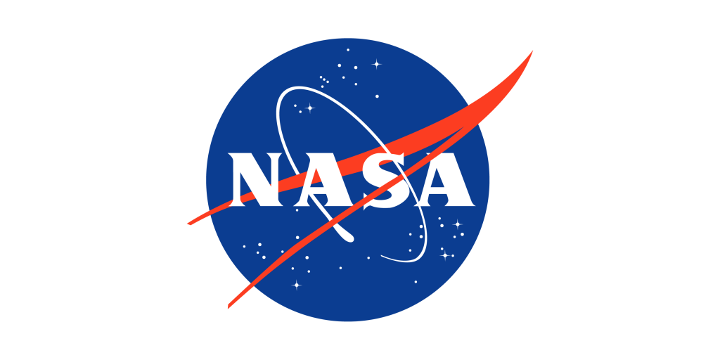
Fondly referred to as “the meatball” because… well, because it looks like a meatball, the logo had everything a fledgling space agency could possibly want: a blue planet, stars, an orbiting ship, and a swooping red hypersonic wing. It’s essentially a literal interpretation of NASA’s early mission. This is the logo that orbited the earth, took that first American spacewalk and landed on the moon. The logo isn’t going to win any design awards (and hasn’t). But it’s an iconic image that has literally traveled to the moon and back. That’s a boast not many brands can make.
Ok. Back into the DeLorean. Next stop, mid-1970. Disco, mood rings, Pet Rocks, and shaggy hair which, thanks to recent quarantines, might just be making a comeback (for me, anyway). With the end of the Apollo program in 1972 (sniff), reduced budgets, and an uncertain future, NASA was looking to rebrand.
This wasn’t really NASA’s idea. President Nixon, of all people, decided that it was past time for federal agencies and departments to upgrade their images. His administration also wanted to change the very nature of NASA’s mission. Less spacey. More generically modern. The idea was to leave some wiggle room for whatever the agency might become.
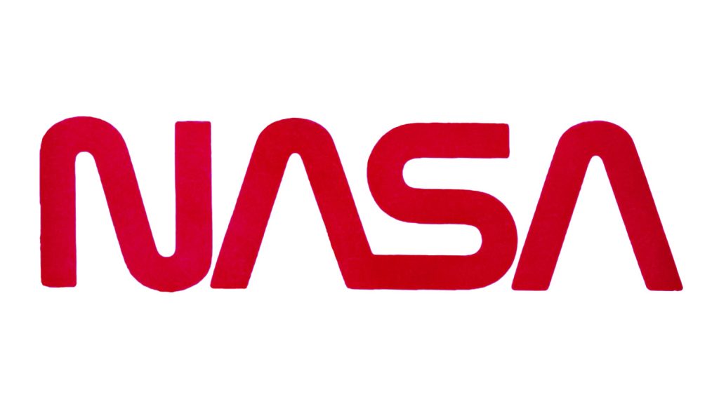
NASA reached out to two young NY designers, Bruce Blackburn and Richard Danne. They presented a single concept. The logo, referred to as the NASA worm logo because… well, because it looks like a worm, was a sleek, clean design that screamed “modern.” It evoked dreams of space stations, moon bases, and commercial space travel. It was otherworldly and unquestionably visionary. Even today, 45 years after its creation, the echo of the NASA worm makes its way into futuristic type design. Want a font from the future? Just remove the crossbar of the letter A. That’ll do it.
Understandably, the NASA old guard never fully embraced the new design. There’s a lot of history infused into “the meatball” and too many senior NASA leaders wanted nothing to do with a Madison Avenue-designed newfangled logotype. In 1992, in an effort to boost morale, the original blue logo reappeared, and the NASA worm logo faded into oblivion.
Until now.
The NASA worm logo is back. At least temporarily. The logo, in all its futuristic glory, will adorn a mid-May SpaceX Falcon 9 launch. And it’s not just any run of the mill SpaceX launch. (Wait. Can we call SpaceX launches “run of the mill” yet?) It will be the first mission to carry astronauts to the International Space Station from US soil since 2011. This is a big deal.
NASA’s current administration appears to think more fondly of the worm logo than their predecessors. That’s good news for design buffs, or really anyone who came of age during the post-Apollo years. The original blue logo isn’t going away any time soon. But here’s one vote for more NASA worm, and the visionary future it represents.