
It’s 2014 — How to Write E-mails for Mobile Devices
 For the first time since e-mail invented, we need to start assuming a mobile audience for our e-mails instead of a desktop audience.
Three big ideas: In my experience, here are the top three things we should do to make our e-mails more mobile-friendly:
1. Use a mobile-friendly physical layout.
- Pay extra attention to the Subject line. Give the reader an idea what you want them to do before they even open the message.
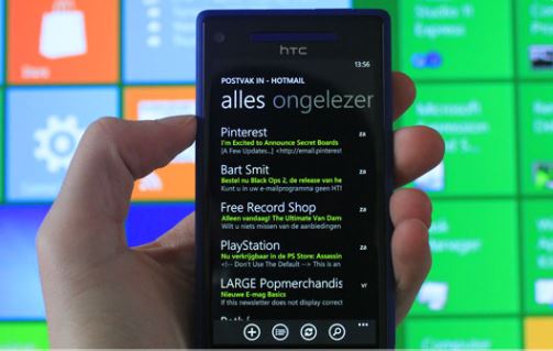
- Use a single-column format. Avoid side columns and multi-column grids.
- Make it text-based. Minimize the use of logos, photographs, graphs, and artwork. Unless these items are absolutely essential for readers to get what they need, eliminate them or put them in attachments.
- Provide links at the bottom of the email for details that most readers won’t need. Limit the main email to the biggest ideas and the details that most readers will need.
2. Make the big takeaways jump off the screen, even if the reader is only scanning the message. Remember to figure out the biggest questions readers want you to answer, and make the answers to those questions obvious. This is even more important than it used to be because of the small screen.
3. Check it yourself. If there’s any doubt about whether your email is mobile-friendly, send it to yourself and try reading it on your phone. The formatting should be easy to deal with and the big takeaways should be obvious.